Marketing Operations
Supported internal marketing teams with brand-consistent materials. Produced practical assets for day-to-day use (print & digital). Ensured consistency across multiple touchpoints and formats.
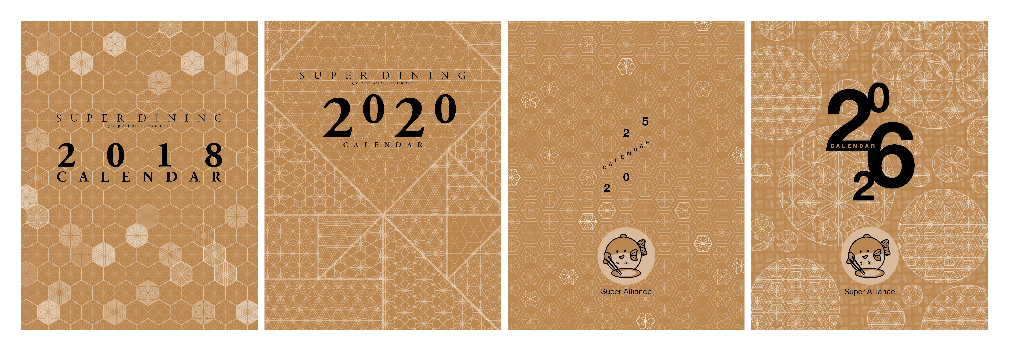
Calendars
Objective: To strengthen B2B and B2C relationships with a premium, functional gift that keeps Super Dining top-of-mind year-round. Solution: A series of annual desktop calendars featuring customised Japanese geometric patterns, designed to reflect the diversity of Super Dining’s restaurants while maintaining a cohesive brand identity. Outcome: A refined marketing premium that delivers continuous brand presence on desks, reinforcing brand recall and positioning Super Dining as a thoughtfully curated Japanese dining group.
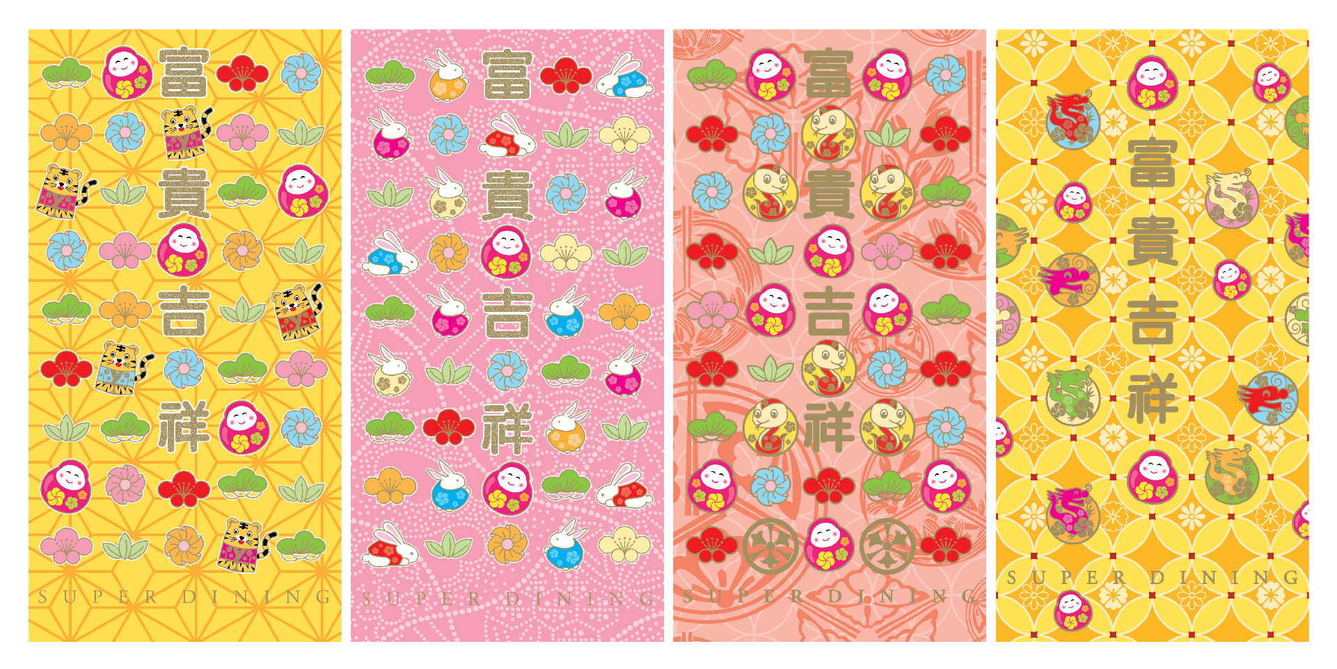
Festive Giveaways
Objective: To strengthen customer, client and supplier relationships during festive periods through culturally relevant branded marketing items. Solution: Designed a customised Japanese money packet that integrates traditional cultural symbolism with Super Dining’s brand identity, suitable for distribution during New Year celebrations. Outcome: Produced a meaningful marketing premium that reinforces brand recall, supports relationship building and aligns with cultural gifting traditions.
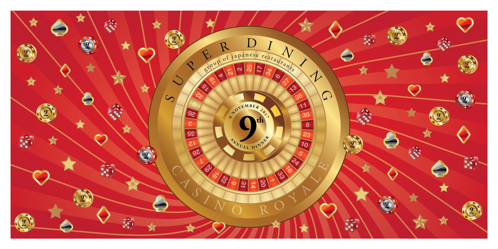
Event Backdrop
Objective: To design a themed event backdrop for Super Dining’s 9th Anniversary annual dinner with 'Casino Royale' as the theme. Solution: A Casino Royale–inspired backdrop featuring a roulette wheel and casino visuals to bring the theme to life. Outcome: A visually impactful centrepiece that elevated the event atmosphere and enhanced the overall guest experience.
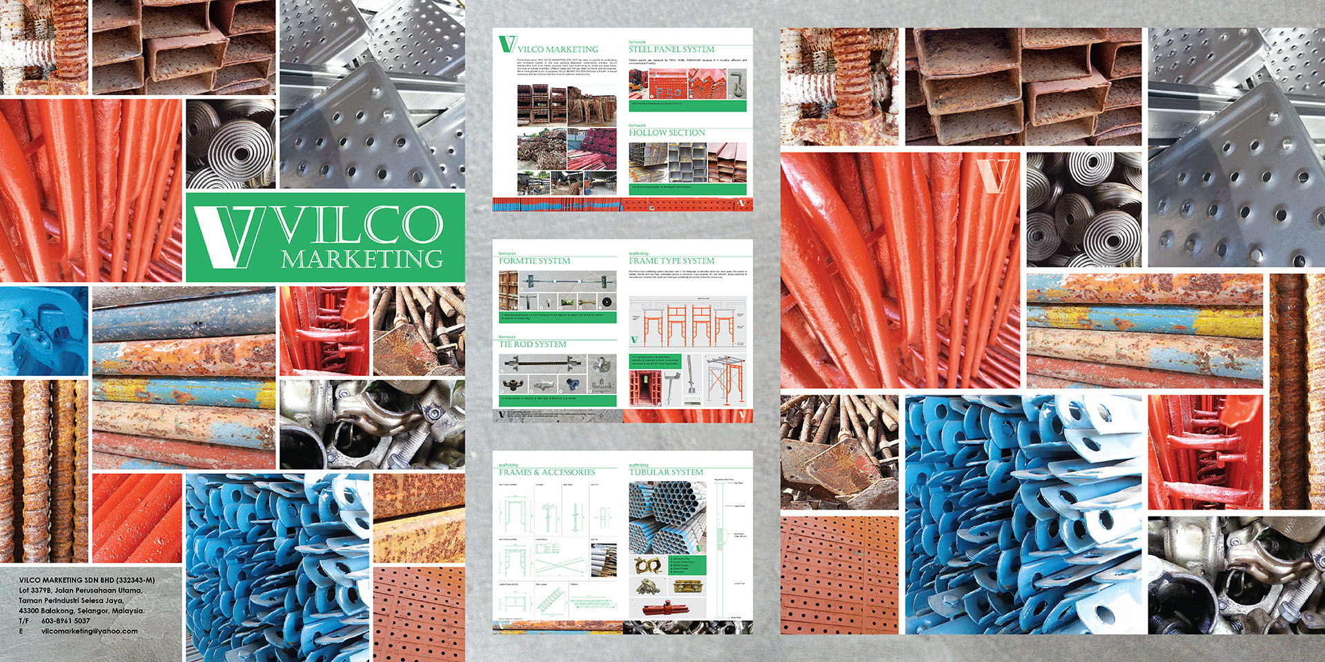
Corporate Brochure
Objective: Communicate Vilco Marketing’s product range clearly using limited, imperfect imagery. Solution: Used close-up photography and a modular layout to embrace material texture and variation as part of the brand story. Outcome: Produced an honest, usable brochure that supports sales and accurately reflects the business’s second-hand inventory.
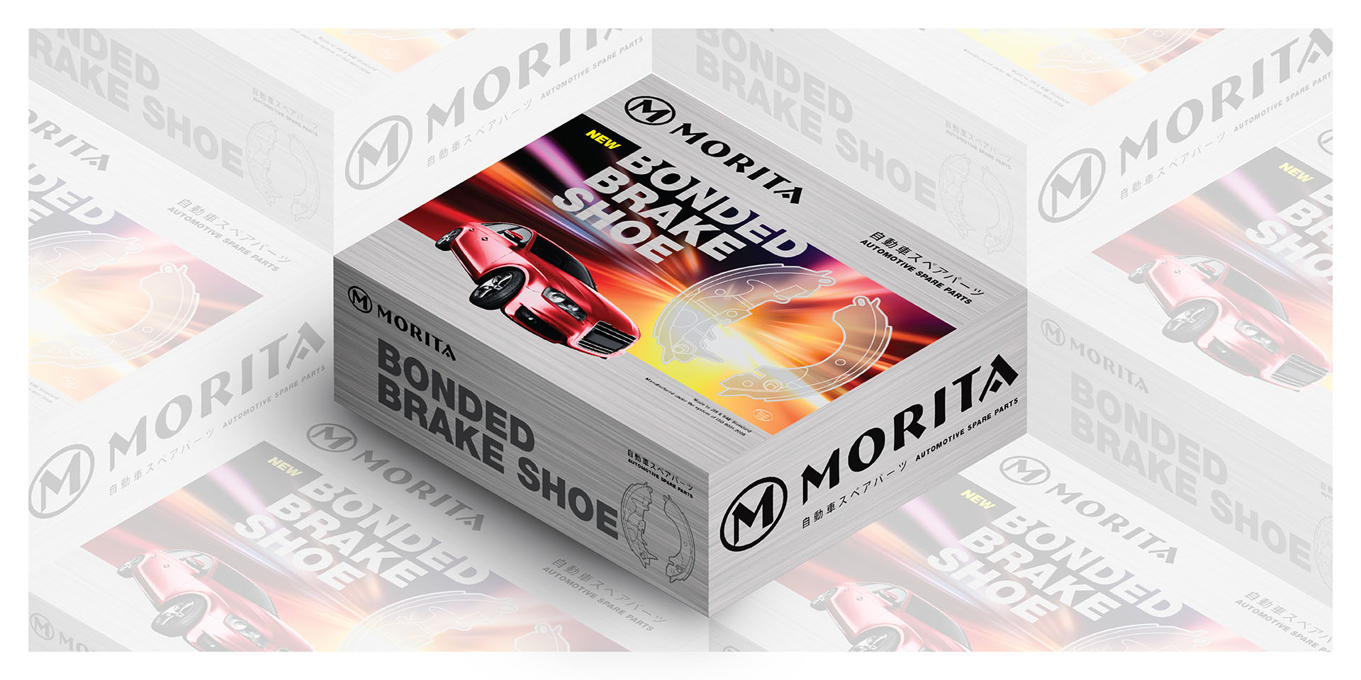
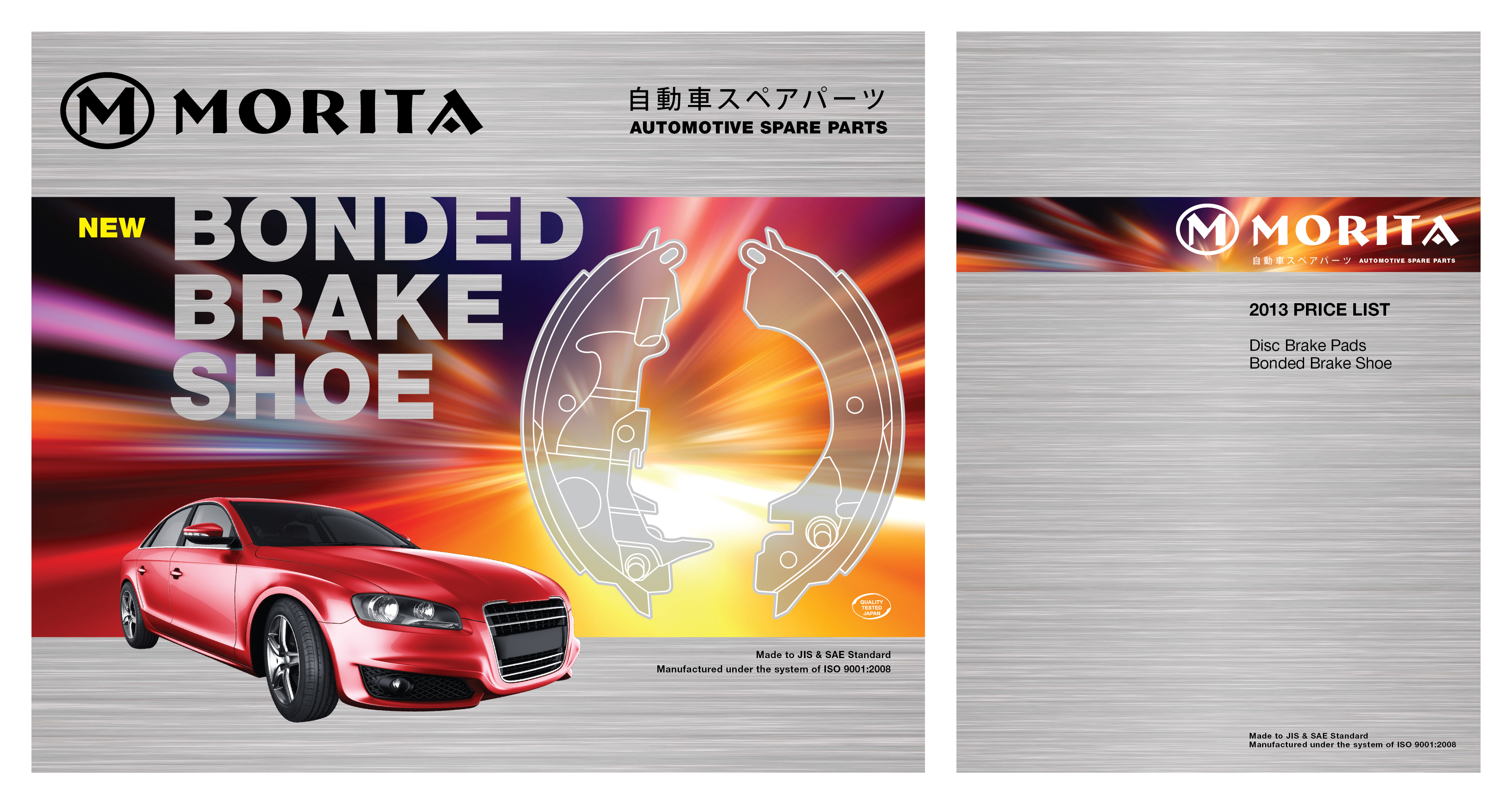
Packaging Design with Saleskit
Objective: Reinforce premium positioning for Bonded Brake Shoes. Solution: Designed a premium packaging system that aligns with Morita’s established brand identity, using consistent colour, typography and layout to communicate quality, reliability and product clarity. Outcome: Delivered strong shelf presence and brand recognition.
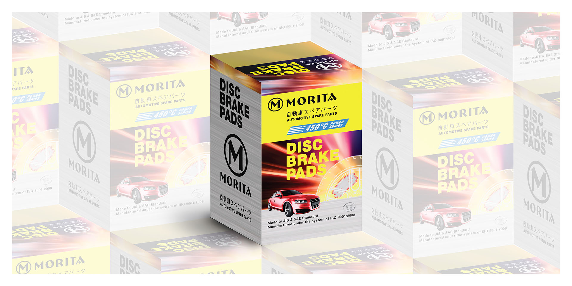
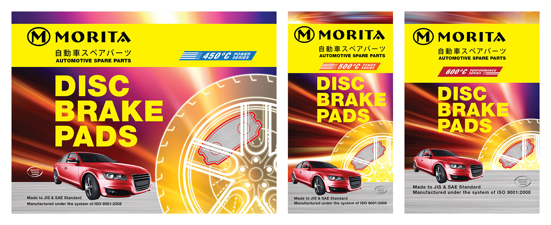
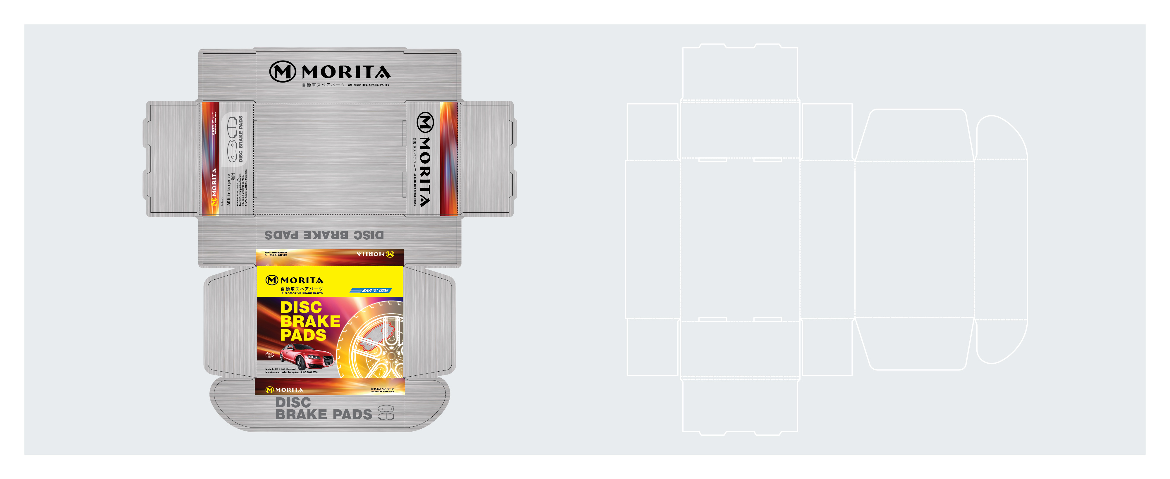
Packaging Design with Product Line Extension
Objective: Support premium branding for Disc Brake Pads. Solution: Designed packaging within a consistent visual system. Outcome: Delivered clear, unified and premium packaging.
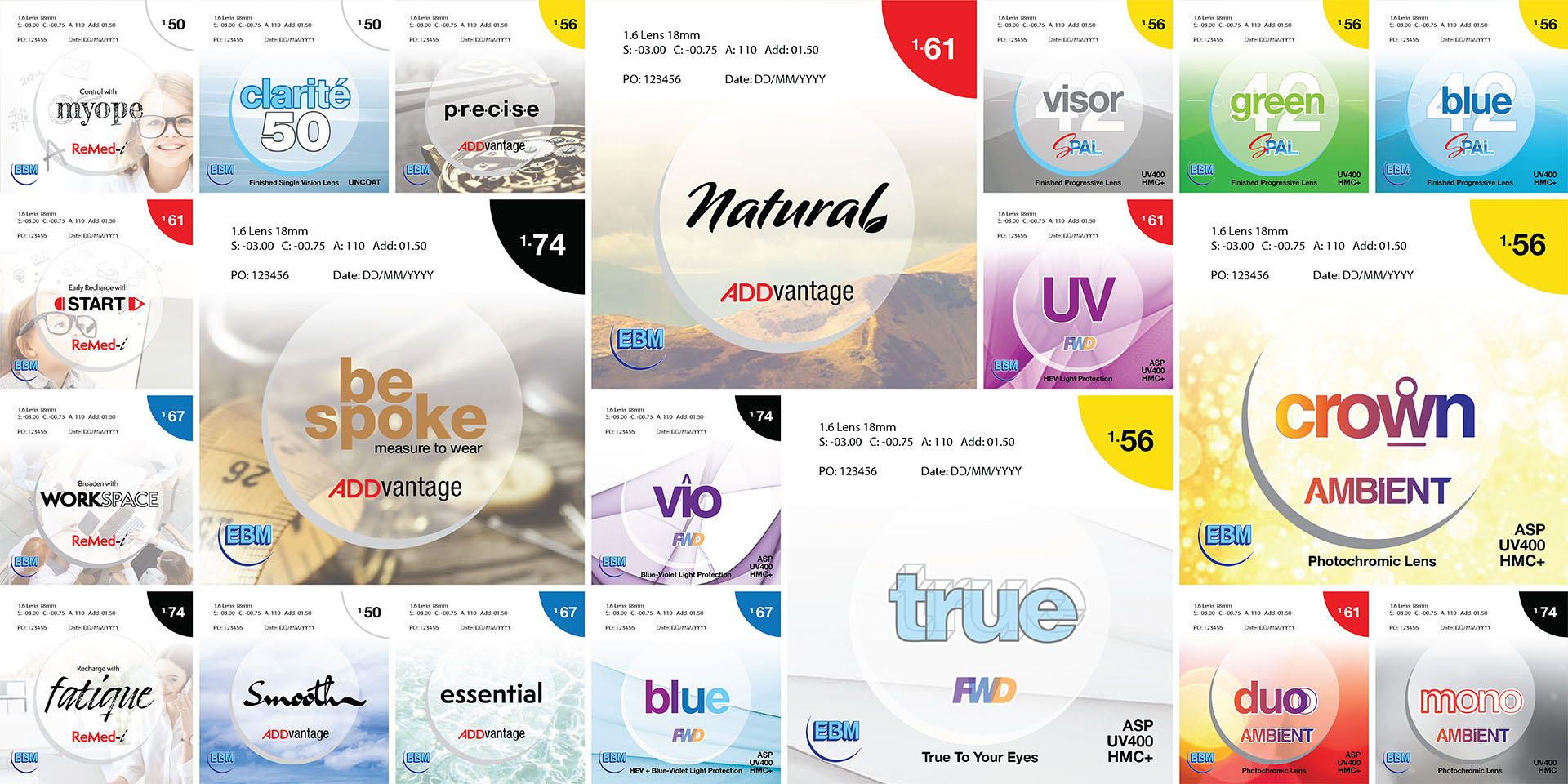
Packaging Design & Product Logo: Optical Lens
Objective: To support clear product differentiation across multiple optical lens brands and performance ranges. Solution: Designed a packaging and logo system that uses visual cues to distinguish product ranges quickly, while maintaining overall brand consistency. Outcome: Delivered a structured packaging system that improves product recognition and supports efficient retail communication.
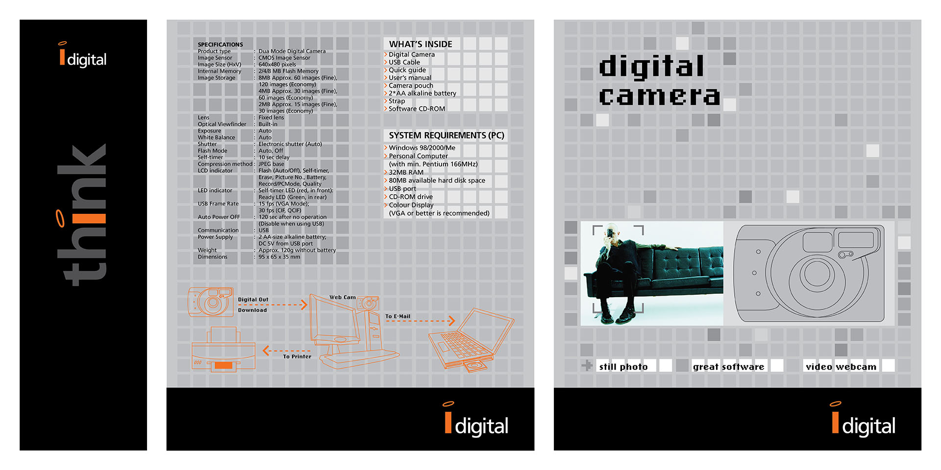
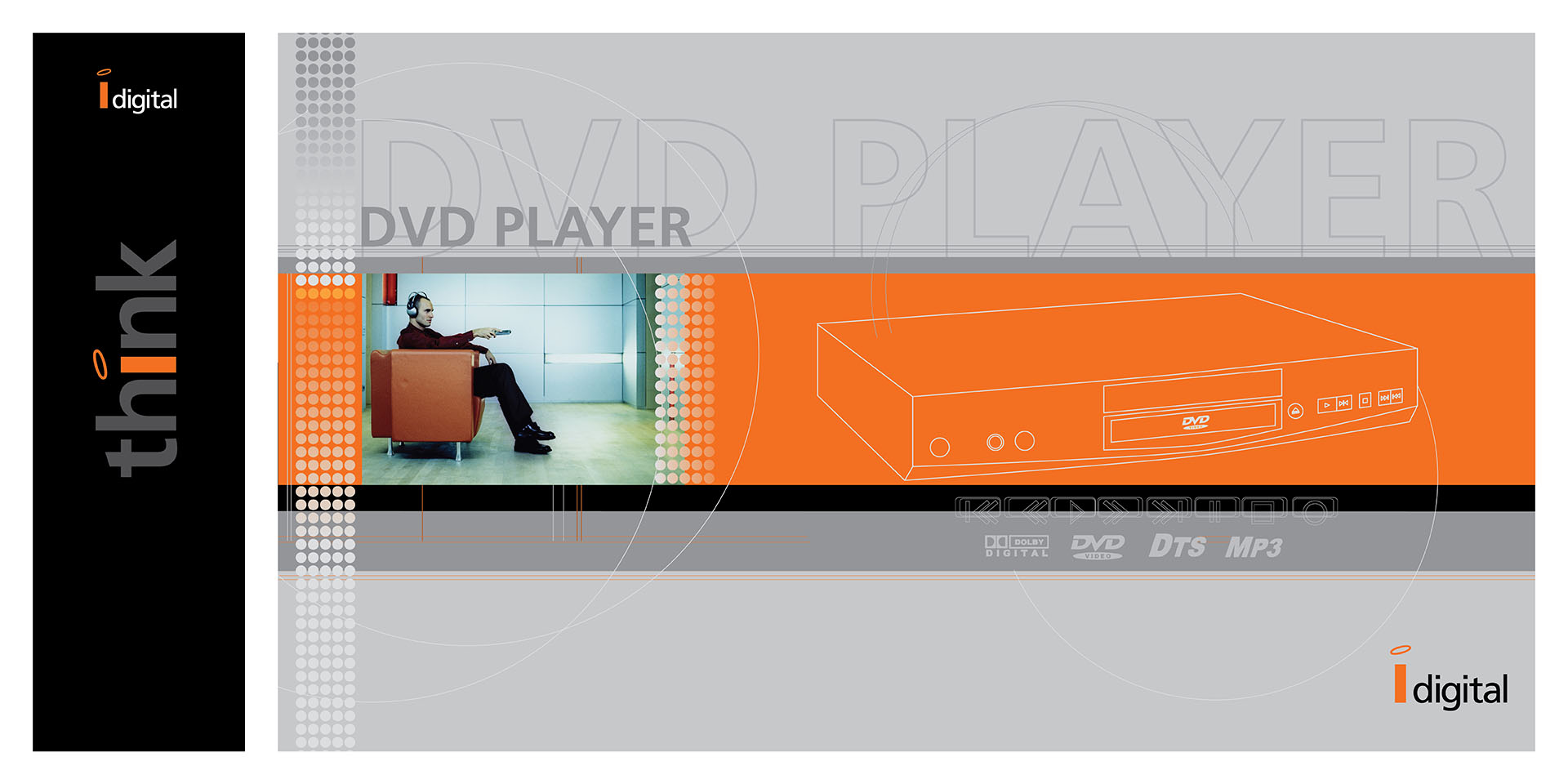
Packaging Design
iDigital — Digital Camera & DVD Packaging Design Objective: Position iDigital products as high-tech and premium. Solution: Designed a cohesive packaging system with structured layout and consistent brand elements. Outcome: Delivered unified packaging that strengthened shelf presence and brand perception.
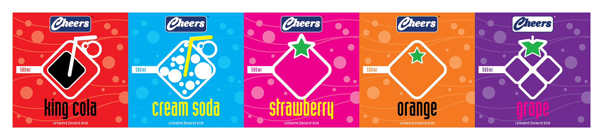
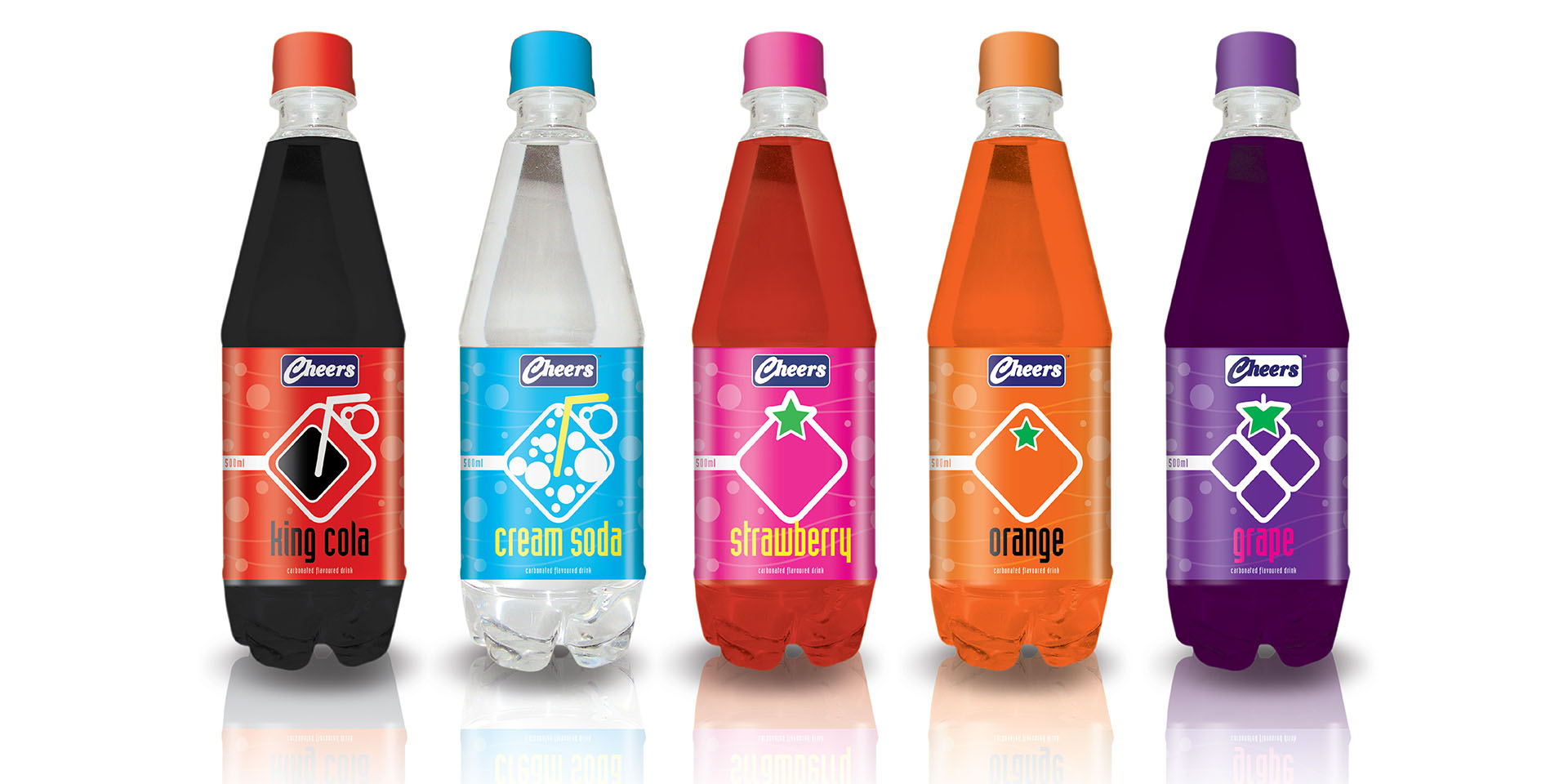
Packaging Label
Objective: To explore a clear and modern packaging direction for a multi-flavour carbonated beverage range. Solution: Designed minimalist packaging labels using simple graphic icons to differentiate five flavours while maintaining a cohesive product family. Outcome: Delivered a clear and scalable label system that supports quick flavour recognition and consistent shelf presentation.
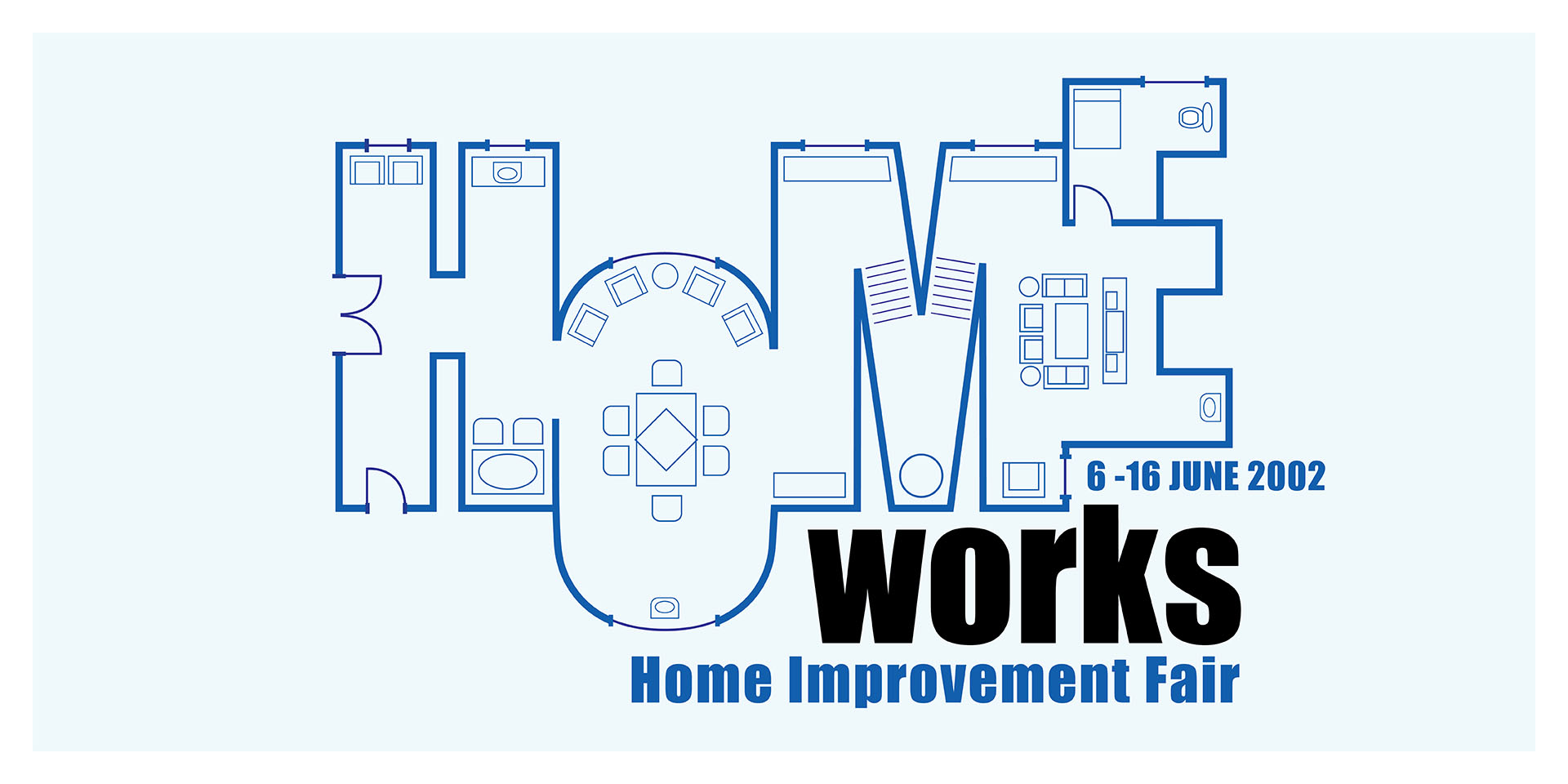
Sales Promotion Theme
Objective: Position Home Works as a comprehensive home improvement fair for homeowners and buyers. Solution: Used an architectural blueprint motif to visually represent home planning and the range of exhibitors involved. Outcome: Created a recognisable event identity that clearly communicates the fair’s relevance and scope.
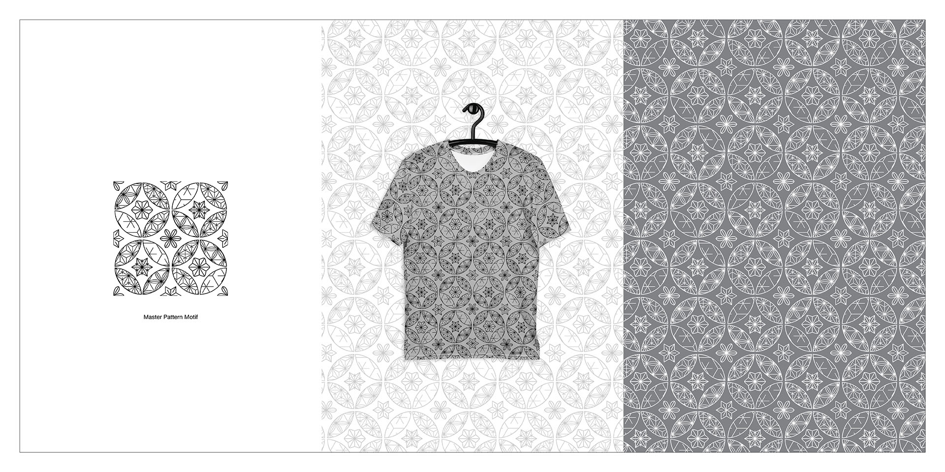
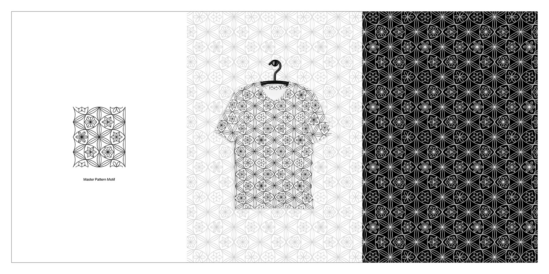
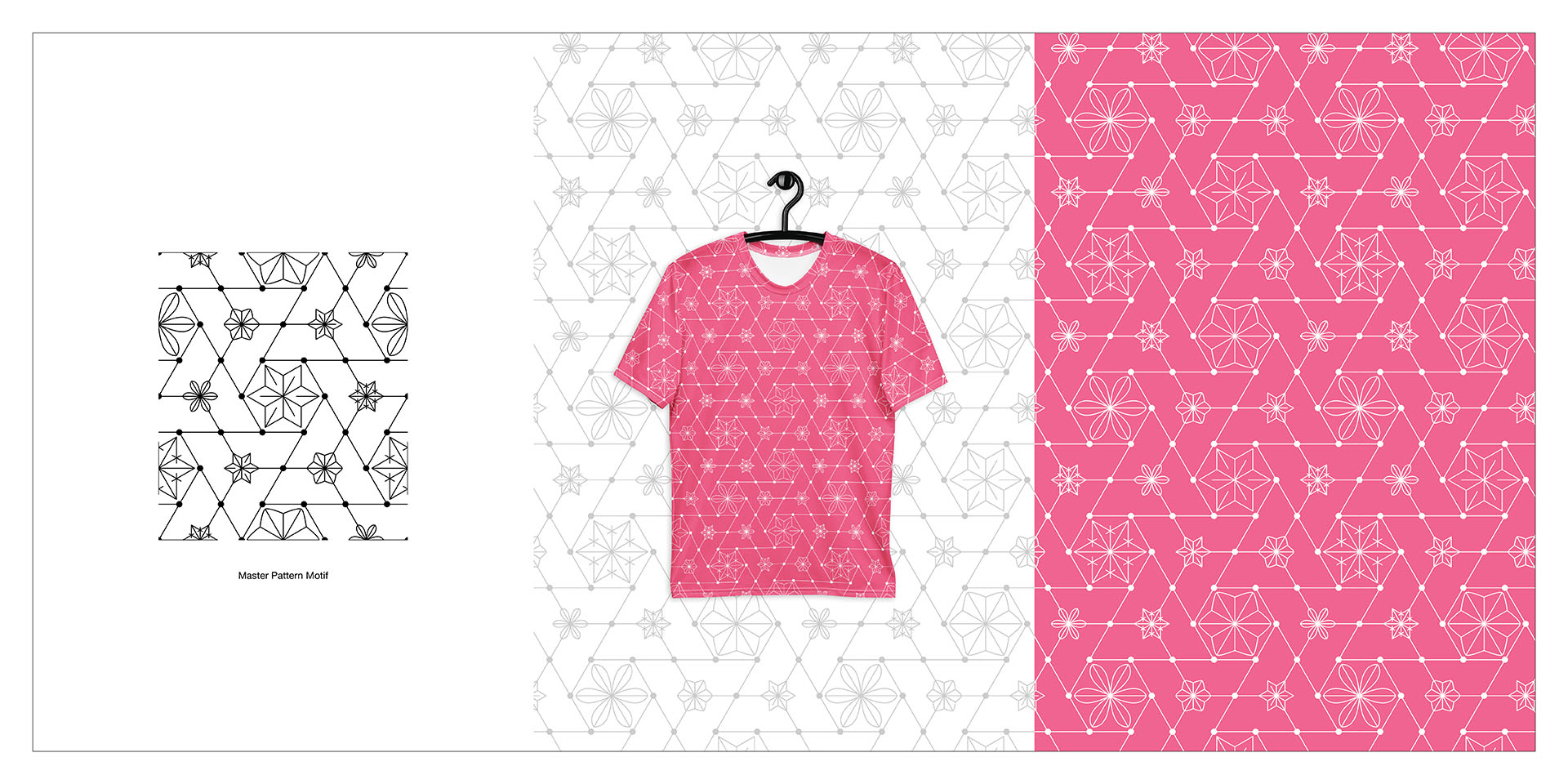
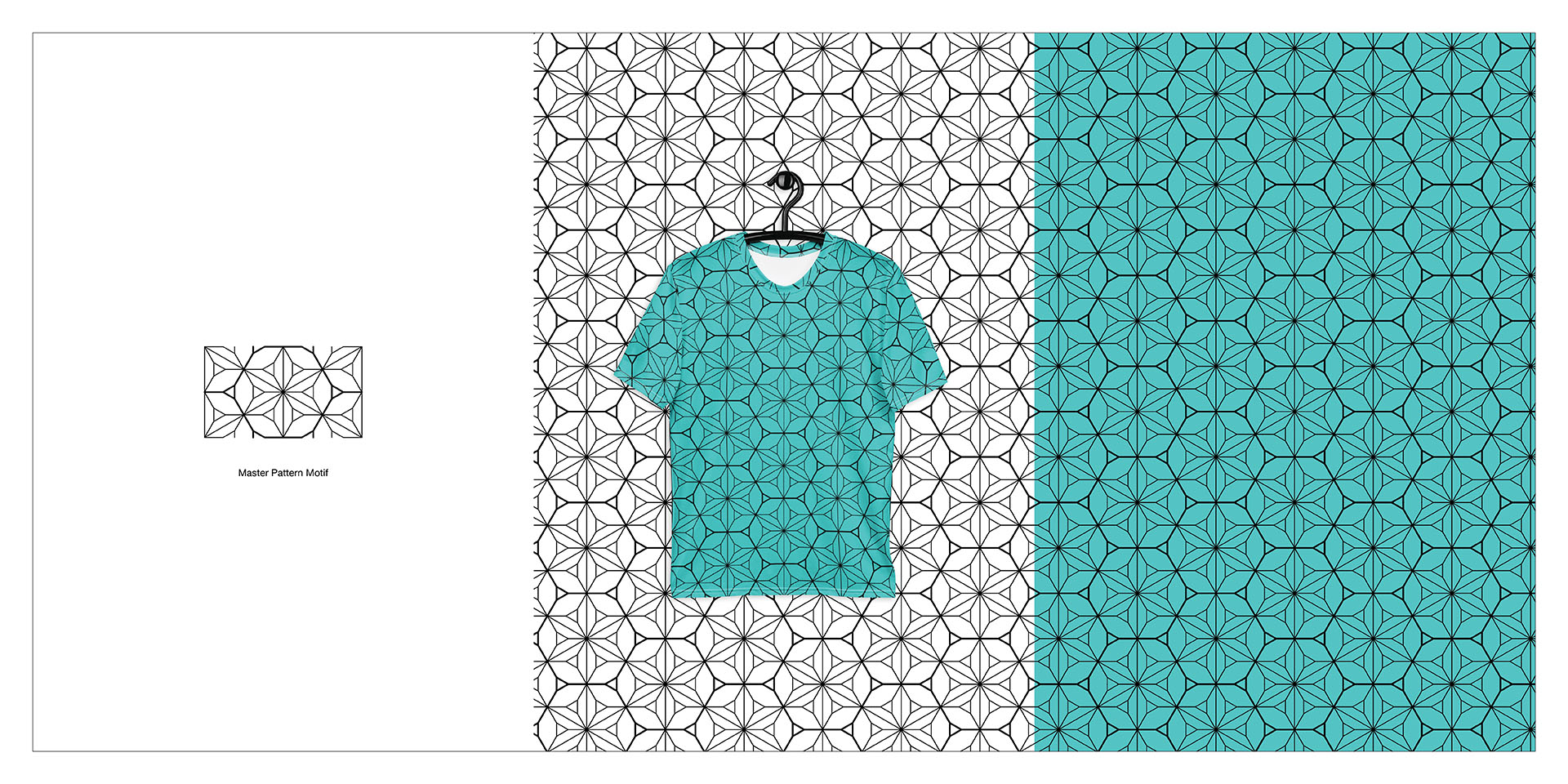
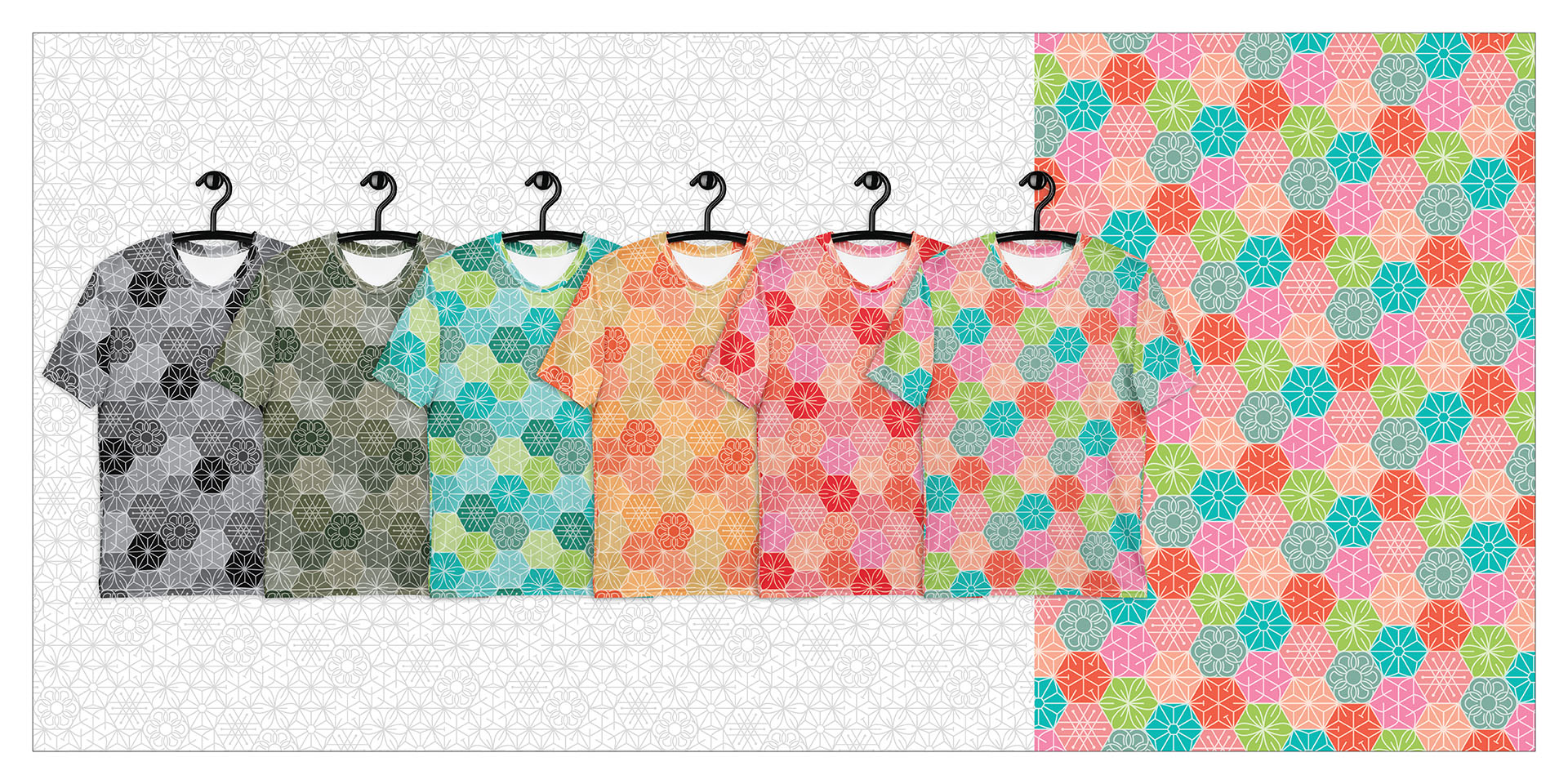
Yardage Pattern Design
Objective: To translate the Patternologist brand identity into functional textile applications suitable for fashion merchandise and production. Solution: Developed repeat patterns suitable for textile yardage. Outcome: Delivered production-ready designs aligned with the brand system.
all works | marketing | presentation | brand | digital | hospitality | creative